
I’ll admit that I’ve grown blase about pitchers and catchers reporting. OK, more than blase — indifferent, jaded, cynical, all of the above.
Obviously this has nothing to do with a disdain for baseball basics. Rather, it’s that the happy moment is a mere moment. Yes, those are Mets pitchers and Mets catchers out there doing vague baseball things next to David Wright, who’s been there dutifully taking grounders for several months. Those pitchers and catchers look about the same as last time you saw them. A few who now sport zipper scars on the inside of the elbow will say positive things about that. Ball is thrown, hiss. Ball hits mitt, pamm.
We might make it after all.
It’s all nice but then that’s it — hiss and pamm, hiss and pamm. Nothing else happens for a couple of weeks that doesn’t involve fabulously expensive bespoke cars, unless someone shows up on a horse and everyone smiles but then suggests maybe no more horses. You hope what passes for news is a steady diet of best-shape-of-his-life cliches minus the term “altercation in the parking lot.” And then you get spring-training games, a more organized version of nothing. Those are the stuff of jubilation for five minutes, pleasant for 25 more minutes and then I feel bad because I’m fidgety and just sighed.
This year, though? This year I’m all for it, at least right now. Bring me the sight of guys in startlingly colored shorts doing not much. Deliver unto me the leather-lunged fan who thinks the eighth inning of a March 12 split-squad game is sweeps week for hecklers. All winters are depressing and baseball-free, but this one is particularly rich in discontent, and a distraction would be just the thing right now.
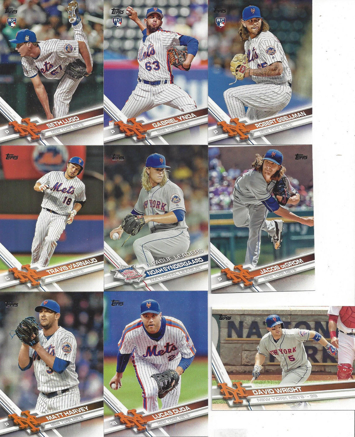
As a little preview, I got my Topps set in the mail yesterday and so happily cleared my schedule to geek out for a couple of hours. For openers, the new Topps cards are the first chance of the year to update The Holy Books: newly minted Mets get upgrades from cards showing them as members of various minor leagues (International, Eastern, American), and I scrutinize the new cards of old favorites to see if something better has come along to represent them.
Every year’s design begins as startling and unfamiliar but will soon become routine and ultimately the stuff of history, which if you think about it is a dress rehearsal for what will happen to the season itself.
So, about the 2017 cards: they look a little frenetic, I’ll admit. They’re all planes and angles and vanishing points, and my first response to the design is to draw back rather than lean forward. But I’m old, and these are frenetic times. The photography, happily, is top-notch, from the much-tattooed Robert Gsellman sticking out the tip of his tongue to Seth Lugo staring plateward with one foot up above his head — a pose that would indicate “car-crash aftermath” for a civilian but is completely normal and even graceful for a pitcher.
My biggest gripe comes on the back. I don’t mind that Topps has included players’ social-media handles. That strikes me as harmless and may even give kids a valuable early civics lesson. (“Well, son, actually the First Amendment means the government can’t tell you what not to say — a private-sector employer can still give you both barrels if you tweet something dumb like that.”) What bugs me is that Topps has curtailed the stats so you only get the last several years’ worth.
That’s a shame, particularly now that Topps once more stands alone as the keeper of baseball history in cardboard. As a kid, baseball-card backs were my windows into the sport’s history, lore, connections and trivia, and that exploration began with the stat block. Your first summer reading card backs will teach you that stats blocks can be classified into a few distinctive and useful categories. Can’t-miss prospects have surprisingly abbreviated stat blocks, with a couple of minor-league years and that first line for the varsity. Perennial 25th men’s stat blocks are jagged travelogues of towns, leagues and organizations, with the names of big-league clubs popping above the Walla Walla/Batavia/Johnson City waterline at odd intervals. And there’s the instant respect you feel for a wall of agate type going back decades — the resume of a Hall of Fame candidate looking back on a baseball life well lived. Instagram handles are perfectly fine, but Topps ought not to have messed with something so fundamental to its mission.
A couple of notes before trudging off into the literal and metaphorical snow:
- There’s a controversy about whether Lucas Duda‘s card shows Duda or Eric Campbell. I’m not great at these things so will wuss out by saying that it’s either Campbell or Duda not looking particularly like Duda. Either way, not a Holy Books card so I’m good.
- Blessedly, Topps gave us vertical cards for Lugo, Gsellman and Gabriel Ynoa, the last of whom is already the property of the Baltimore Orioles. Everyone raised with a functioning moral compass understands that horizontal cards are tools of the Devil; Topps thankfully gave us only one horizontal Met this time around, and they’re forgiven because it’s a pretty good shot of David Wright, who already has plenty of cards.
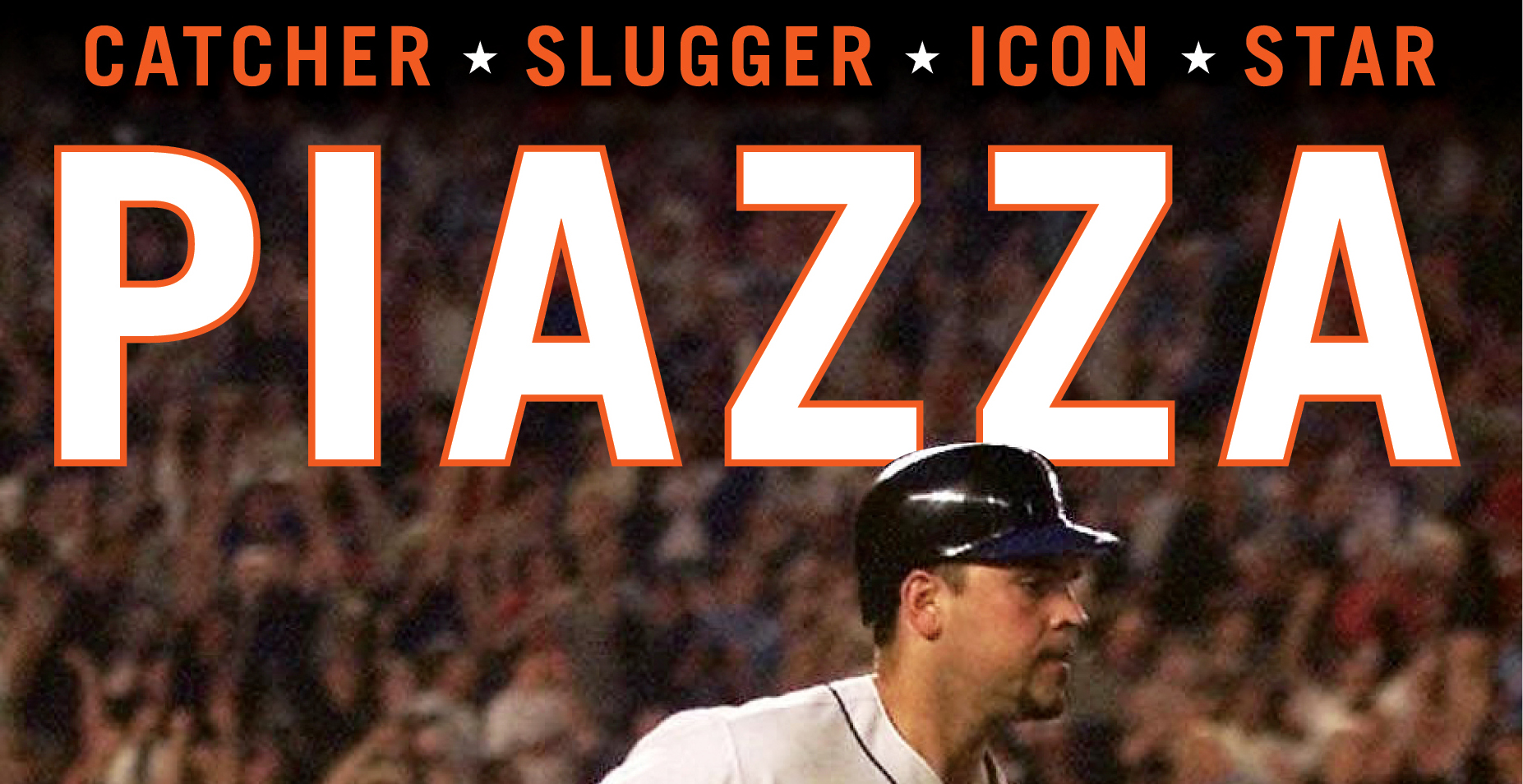
- The inserts are fun — first pitches are back, with Judd Apatow doing the honors at Citi. But the standouts are 1987-style cards for Yoenis Cespedes, Mike Piazza, David Wright, Jacob deGrom, Noah Syndergaard and Michael Conforto. I’m in the midst of a losing campaign to convince myself I don’t need these. Of course I need these. You may too.
And so the baseball-card clock is running again, just when I needed it the most. Soon it will be time for Topps Heritage (this year’s design is the underwhelming burlap-and-scrawl ’68, but points for respecting history), the prepackaged team sets with their oddball alternate shots, the Opening Day set (which gave Ruben Tejada a Mets card last year) and then the countdown to Series 2.
By which time baseball itself will be in full swing again. Needless to say, I can’t wait.


Holy Gary Pettis’s 15-year-old brother, that is SOOOOOO Eric Campbell.
Yeah, if that’s Lucas Duda, then they could use a photo of me for Bartolo Colon. That’s bat boy as Aurelio Rodriguez not him. And if I’m not mistaken, Gsellman is much tattooed on the left side only, I guess avoiding tattoo-related injuries to the throwing arm.
And Jason, truer words were never written. This winter of discontent screams out for baseball, even if only games filled with shortstops wearing #91.
Guess Duda wasn’t in any games long enough for them to get his picture. Around May15, they may need that same guy to play 1B…….. or 3B, for that matter.
Not a collector any more, but too bad about the lack of stats. I still remember being impressed when I would see “Brooklyn” on the back of a Koufax or Drysdale card. It seemed so ancient to me in 1965, even though it was only 8 years ago at the time.