A sportswriter once asked Yankees owner Colonel Ruppert to describe his perfect afternoon. Replied Ruppert: “It’s when the Yankees score eight in the first and then slowly pull away.”
Wrong team, different margin, but yeah — a flurry of first-inning Mets hits was all Bartolo Colon would need, and all we’d need with our team finally back home after weeks of wandering the post-All-Star Game world. Epic drama is the lifeblood of a baseball fan, but a nightly dose of it is a hard way to live: the occasional laugher makes for a very nice respite.
The only flaw exhibited, as far as I saw, was that the Mets were wearing their horrible Padres-style camo ensembles. I’m all for Military Monday and supporting the troops, but the sand-colored togs might actually be the worst outfit this team has ever worn — they’re an incoherent mess that assaults the eye more viciously than the return of the tail, the brief-lived white ice-cream hats and most everything you can think of except the Mercury Mets, and that was only for a night. Want to make Military Monday special? How about a flyover, extra introductions of men and women in uniform, and scoreboard features about Mets who served? (In fairness, I haven’t been — perhaps some or all of these things happen already.) Freedom from terrible uniforms would be a small tribute as well.
Speaking of uniforms, an interesting bit of Mets lore popped up yesterday. The Mets’ baseball logo was created in 1961 by cartoonist Ray Gotto; back around the time of QBC ’14, uniform designer Todd Radom revealed the surprising discovery that Gotto first created the logo in pink and black, with publicist Lou Niss requesting that the colors be changed to orange and blue. That was both fascinating and baffling: black was a couple of generations away from its later vogue, and pink seemed as unlikely then as it does now. But Radom kept digging and discovered yesterday that there was a perfectly logical reason for Gotto’s choice: pink and black were the colors of Greentree Stable, owned by Joan Payson and her brother John Hay Whitney.
The Mets had a glorious period in black, and pink has crept into the palette for Mother’s Day and games dedicated to fighting breast cancer. But pink and black? Maybe it’s just the aftereffects of a night gazing at Colon swathed in yards of camo, but why not try it for a night or few? I’ve always wished the Mets would try throwback uniforms designed to showcase the alternate names for the franchise — the Skyliners, Meadowlarks, Continentals et al. (I’ve long thought Skyliners would have been a badass name for a franchise, but that’s another post.)
“Meadowlarks,” in fact, was Payson’s preferred name for her club. Why not Joan Payson Night, with the Meadowlarks taking the field in their pink and black home alternate uniforms?
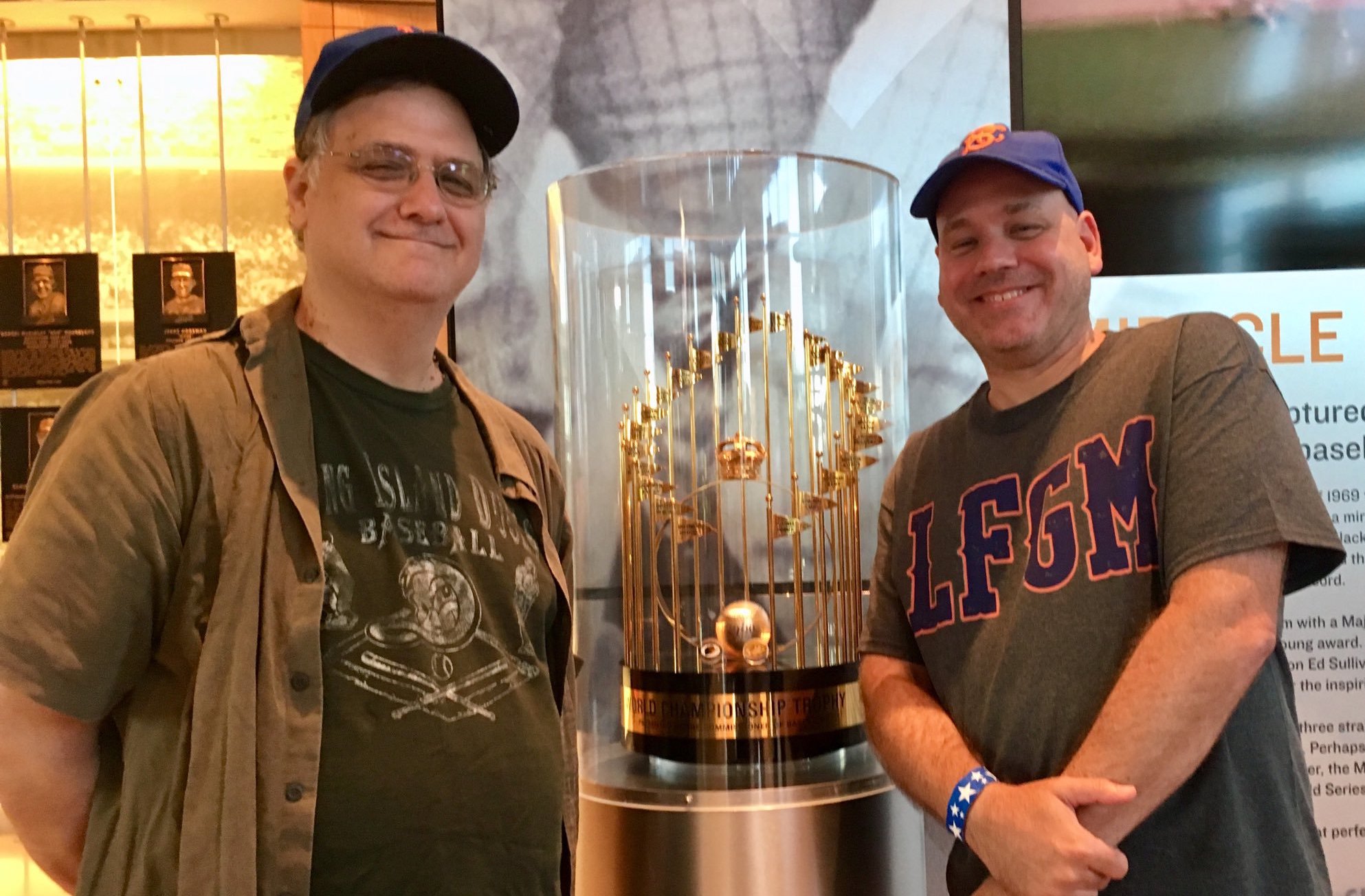


I have a book about the Mets written by Leonard Koppett just after the World Championship in 1969, and he spends many pages discussing the naming of the team. He says that Mrs. Payson liked Mets and that was the deciding factor. He posts a two page list of the various names that were suggested by fans. Some are kinda out there. BTW, I must have read that book 20 times between 1970 – 1975.
My wife was thoroughly appalled. Her best quote, after an entertaining 5 minute rant: “No woman had anything to do with this”.
Please…..no more alternate jerseys, hats, colors, names…anything. Can all teams please go back to one cap, and home whites/road grays?
I never knew that stuff about the pink & black. Great find. I think a throwback uniform designed to showcase an alternate name for the team is a wicked kool idea. I’d never buy one of those ugly camo unis, but I would be very tempted to get one of those alternate ones if they were done up right.
And nothing..NOTHING!, was as bad as the tail.
Pink and black? Screw Rheingold, bring the kiddies in with Good N’ Plenty candy! (Pink and white coated black liquorice candy in a pink, white and black box) And the early Metsies had a Choo Choo Coleman to go with GNP spokeskid Choo Choo Charlie!
Adopting a color associated with communism might have been awkward considering that the Cuban Missile Crisis and the construction of the Berlin Wall happened right when the team was getting started. The early ’60s Mets had enough challenges without also being accused of being a Soviet front group.
Wasn’t that around the same time that the Cincinnati Reds temporarily changed their name to the Redlegs? “Better dead than Red”, and all that? Point well taken.
[…] Back in the (Pink and) Black? » […]
Two words, Jason:
Mercury Mets.