
Somehow even people who aren’t baseball fans know that spring is about renewal. Bare tree branches begin sprouting tender green buds. Flowers and bright shoots of grass poke out of the earth. The sun’s around a little longer and starts to feel a little warmer. Everything feels fragile, but with the promise of heat and life ahead. It’s true of your backyard and also of that first few days of the new season. You know, the part where you know every score without straining for details, yet alone reaching for a reference.
This year, backyards are still doing their thing, but baseball is in lockdown like the rest of us. We’ve rapidly gone from “maybe there will be games but without fans” to “everything will start a few weeks late” to “I suppose a two-month season would still count.” And subconsciously, we’re already beginning to make whatever peace we can with the idea that there won’t be a 2020 season at all, and we will have to skip ahead to 2021 and a world in which a whole lot will have changed besides baseball.
Old habits die hard, though. (That’s how they get to be old habits.) I find myself checking The Athletic each morning, or looking to see if there’s Mets news on MLB.com. There isn’t, which is bad; the next round of such news is almost certain to be grim, which is worse.
What we have been given, I’ve devoured. On Twitter Pete Alonso was his gracious, well-spoken self about this strange new reality, a natural disaster in which the peril is ourselves rather than something around us. Then Alonso teamed up with Luis Rojas to send a pitch-perfect message of comfort and cheer to one of our fellow fans who could really use it.
Denied my primary familiar pleasures of games and roster moves and reporters’ notebooks, I’ve sought comfort in a secondary familiar pleasure. Baseball cards have kept following their release calendar even as baseball has proven unable to, and for that I’ve been grateful.
These days, the year’s first series of Topps cards shows up in early February, a diversion that feels equal parts welcome and artificial. The end of that month brings Topps Heritage, a recreation of a decades-gone yet — this year they’ve reached 1971, with its black finish and very much of-its-time lettering. (Manager cards have gone by the boards, alas, but that’s another post.)
Then March brings two more sets, or at least quasi-sets. Topps Opening Day arrives a couple of weeks before the actual event of that name, with a jaunty logo of bunting — in the “red, white and blue” sense of the word and not the “I am unwisely surrendering a precious out” one. Next to appear are the prepackaged team sets you can find at ballpark stores next to foam fingers and pennants, known in the trade as “factory team sets.”
Both of these sets are of interest primarily to completists, but offer their share of fun quirks. Opening Day has Topps cards that won’t show up until Series 2 and a tradition of entertaining inserts, which are cards outside of the main sets, printed in limited numbers and commanding a premium. The factory team sets are the first place to get cards of players who joined a franchise over the winter and are deemed significant to its fortunes. Once upon a time, such cards would have featured either airbrushed hats with hand-drawn team logos, or players in the pose known as “BHNH,” for Big Head No Hat. Now, players get Photoshopped into their new uniforms.
April brings Bowman, a brand name that’s what remains of a company that preceded Topps in the card business but was swallowed up by it in the 1950s. But by then, normally, there are actual games to obsess about, and baseball cards take a backseat to the thing itself.
This year we’re shorn of “normally,” and boy am I looking forward to Bowman — and everything else that I hope will still be coming our way.
In the meantime, here are some highlights and oddities from early-season baseball cards. Little things, I know. Very little things. But that’s what we have.
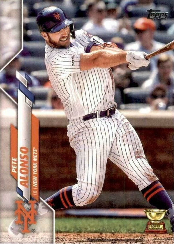
Pete Alonso’s early Topps cards called him Peter; he got a 2019 Series 2 card in the flagship set, unfortunately in that dumb blue softball uniform. But his 2020 card is a keeper — Pete dieseling a baseball, dirty with hard work and wearing his socks properly high. Plus his card bears the coveted Topps rookie cup. This card made me happy the first time I saw a preview image of it, and it’s made me happy every time I pick it up since then.
Alonso, of course, has a ton of other cards these days — leader cards, team highlight cards, inserts, autograph issues, and what-not. And several of his cards are SPs — short prints, which are harder to find if you’re someone who still opens packs and more expensive if you buy them on the secondary market.
This is a good problem to have as a Mets fan and a baseball-card dork. Paying a premium isn’t my favorite thing, but I logged plenty of years during which few if any Mets cards were worthy of being printed at all, let alone short-printed so someone would be willing to pay extra for them.
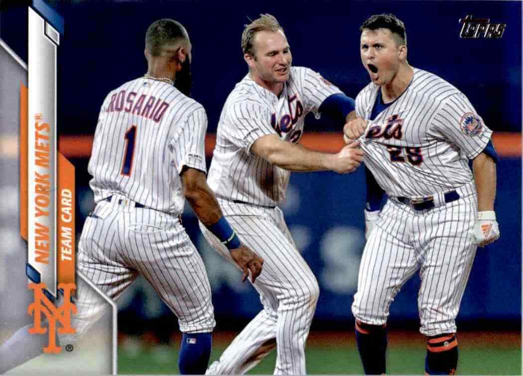 Like his friend Pete, J.D. Davis also got saddled with a dopey blue-top card in last year’s Series 2, but here he is in all his Solar Bear glory on the flagship set’s team card. Plus as a bonus you get a very determined Polar Bear pulling on his uniform, about to create work for the clubhouse attendants.
J.D. Davis, man. His initials are actually J.G., he’s baseball’s chirpiest heckler, he’s quite obviously mildly insane, he can’t play third base and can only kind of play left field, and I love him to pieces. I hope he’s still a Met in his Julio Franco years, even if he never rises above his limitations and the National League ignores newfangled folderol from jumped-up minor leagues and refuses to sully itself with the introduction of the designated hitter. Don’t care; we’ll find a spot for J.D.
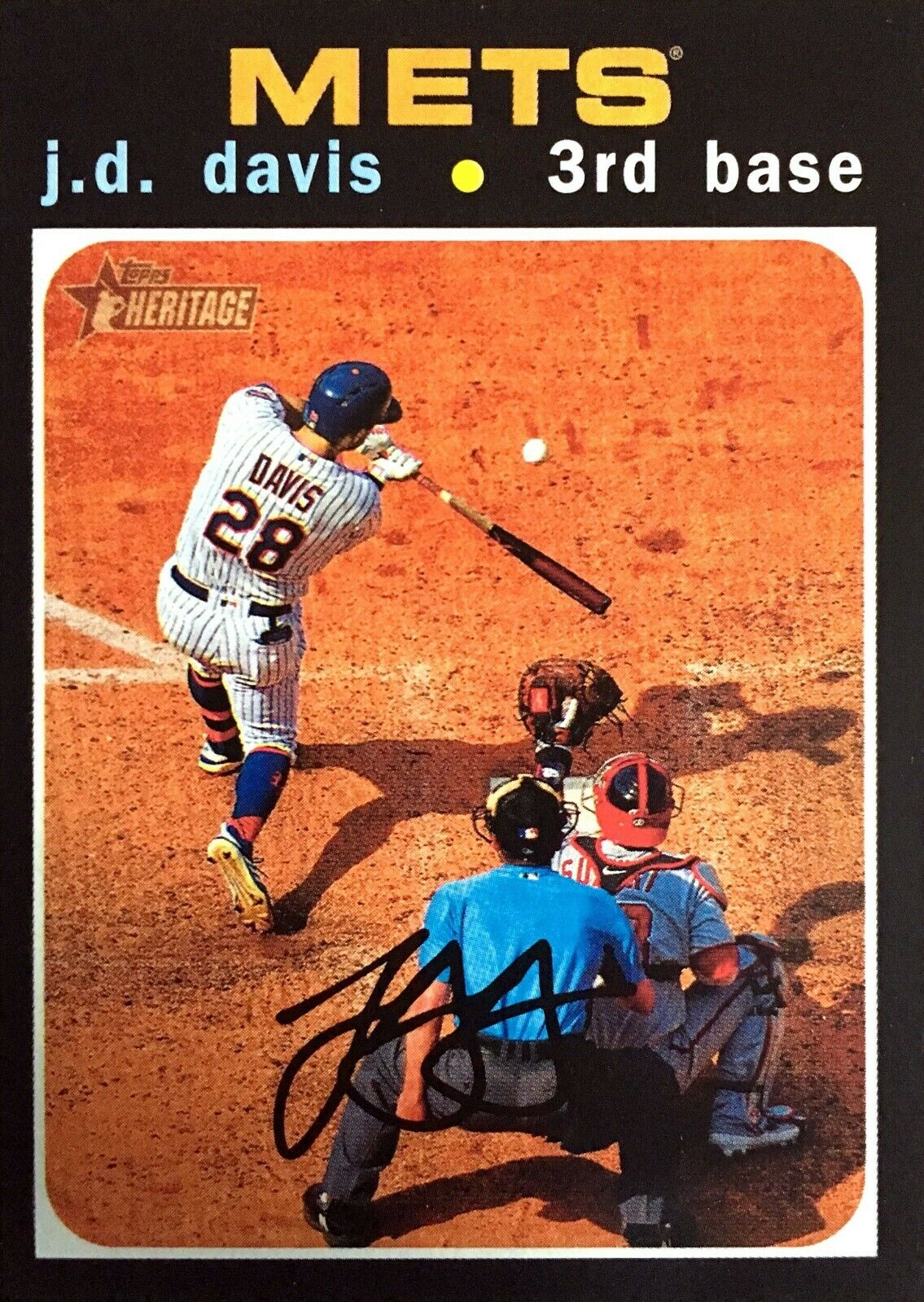 Speaking of Jonathan Gregory Davis, here’s his Topps Heritage card. This is not an ideal shot for a baseball card, but there’s a purpose behind that — the ’71 cards introduced “action shots” into Topps’ repertoire, with sometimes comical results. For instance, Bud Harrelson is one of five people visible in his card photo, a tag play at second. He’s less prominent on his own card than the second-base umpire and Nolan Ryan, who’s watching from the mound, his shoulders suggesting he’s slightly weary of it all. J.D. swinging at a pitch would have been a pretty good action shot for a ’71 card, all things considered. Kudos to Topps for respecting such traditions, as they have throughout Heritage’s run. Most famously for our purposes, the 2011 Heritage set used 1962’s design. There’s no Mets team card in that 2011 set, and most of the Mets are in the BHNH pose — things that made card collectors fuss but made me cheer, because Topps was recreating what had happened with the actual ’62 Mets cards.
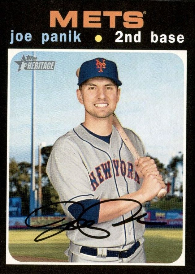 Next we come to Joe Panik’s Topps Heritage card. Joe isn’t a Met now — his new employer is the Toronto Blue Jays. And if you’re sharp-eyed, you may notice that he’s not a Met in that photo, either — he’s a San Francisco Giant turned New York Met via the wonders of Photoshop. Much as I love Topps, their current near-monopoly on the baseball-card market has eroded quality control a bit — recent years have seen players repeated between Series 2 and Update, show up on rookie combo cards as well as their own solo cards, and other small production bobbles. Given the uncertainty of his 2020 employer, Panik could have been reserved for Heritage’s high-numbers series, in which case he’d be a Blue Jay; failing that, Topps had ample opportunity to get an actual photo of him as a Met. Still, it’s a Joe Panik Mets card that I never thought would exist, and that’s a Good Thing, whatever asterisk you want to put on it.
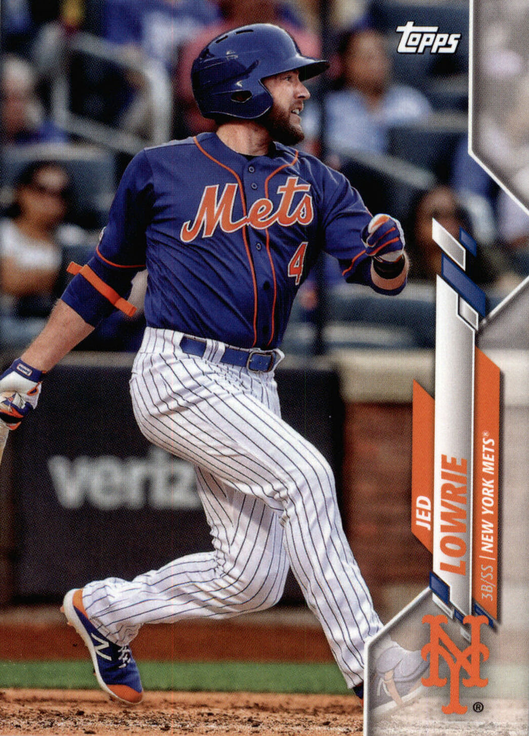 Here’s the opposite of the Joe Panik card. Yes, that is a 2020 Topps card featuring Jed Lowrie as a Met, from the factory team set. And there’s no Photoshop involved — it’s a shot from Lowrie’s cameo on the active roster. It’s a blue top, but that’s my own prejudice intruding — all in all, it’s a pretty good card. Certainly much better than Lowrie’s 2019 Topps Heritage card, in which his expression is that of a man trying to be polite but worried that the big, overexuberant dog he just met is about to ram its snout into his nuts.
This card’s existence is one of the reasons hardcore card dorks like me always seek out the factory team sets: They sometimes include Plan A players who never make the Series 2 or Update sets because their teams have gone on to Plan B. Which might well happen to Lowrie — though perhaps a very belated Opening Day will mean he’s shed his brace and the baggage of his mysterious injury.
One can hope — as I like to say, hope’s free.
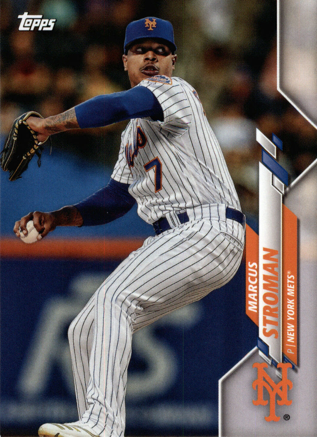 Here is Marcus Stroman’s 2020 team-set card. Assuming there’s a Series 2, Topps will probably reuse this shot, and with good reason — it’s a stunner. It also made me happy because it shows Stroman wearing 7, instead of the 0 he’s switched to. Stroman’s easy to root for, a bulldog pitcher and demonstrative teammate, but no player should wear 0, because it’s self-evidently ridiculous.
(To be sure: When the season starts, I will be overjoyed to get to watch Marcus Stroman wearing zero. If for some deeply weird reason that’s what it takes to DFA coronavirus, every Met can wear zero until the sun goes supernova and you won’t hear a peep from me. OK, that would never be true. But I would limit myself to muttering about it.)
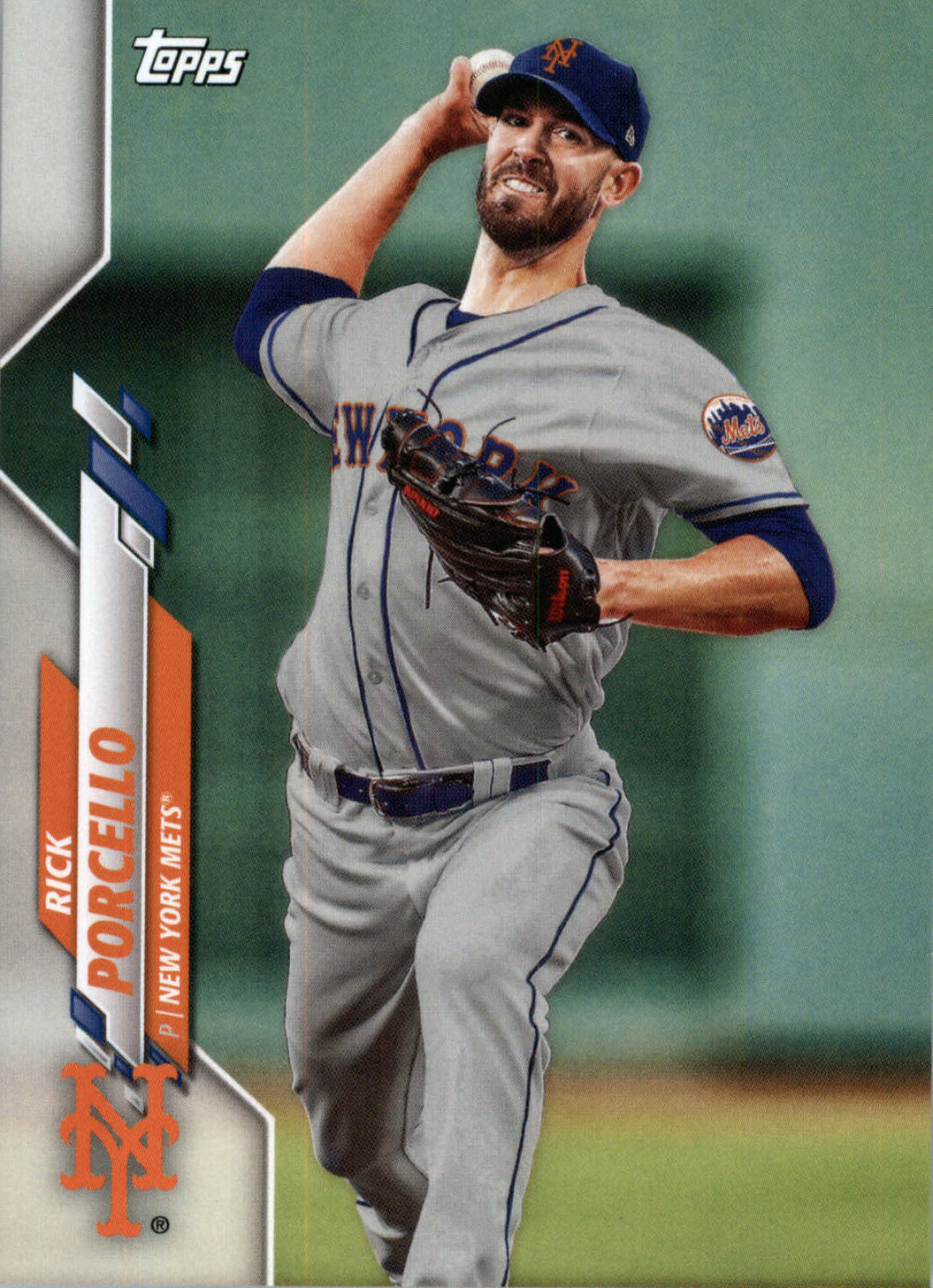 Here’s another Photoshop job, this time from the factory team set. That’s Rick Porcello as a Boston Red Sock, pretty convincingly retooled as a Met. One of my dorky hobbies is making custom baseball cards, which means I’m conversant with Photoshop and know which uniforms are easy to convert into each other. Piping and arced letters make a switch from RED SOX to NEW YORK pretty straightforward — I made a bang-up custom of momentary Met Dave Eilers based on a photo of him in a late-60s Houston Astros away jersey, which shares the same characteristics. And I’ll bet you anything that photo was selected because the position of Porcello’s glove meant his uniform number didn’t need to be added. The background’s the tell, of course — Citi Field borrowed bits and pieces from a number of parks, but doesn’t have a Green Monster.
Should there be a Topps Update set this year — and oh, let’s hope there’s a reason to need one — Porcello will almost certainly have a Met card shot in a Mets uniform, making this card a curiosity.
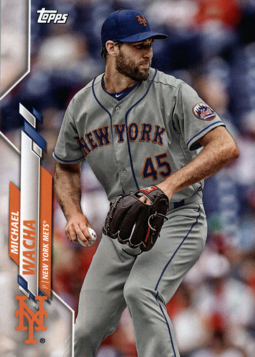 If you want to know why Topps chose that picture of Porcello, Michael Wacha’s Photoshopped team-set card is the answer. Letters, numbers and patches flex along with the uniforms to which they’re attached, but images snipped from one picture and added to another tend to look like they’re floating. Photoshop has tools for bending and warping images, but it’s devilishly hard to make the results fool the eye. The Mets logo on Wacha’s sleeve looks pretty convincing (it’s better than Porcello’s), but that 45 is kind of along for the ride. As someone who’s made many a custom card with a floaty Met uniform number, I feel the Topps designer’s pain here. But more importantly, I’m grateful to him or her for giving me an early Wacha card.
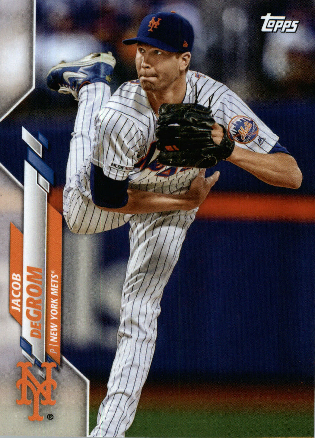 Topps’ oddest early-season offering may be the factory team sets reserved for National League and American League “Standouts.” I guess this hearkens back to the days of opening a pack and triumphantly holding up an All-Star card (“I got Johnny Bench!”), because who wouldn’t want a pack that’s all All-Stars? But in this day and age I wonder who, exactly, those two neo-team sets are for. The grandparent who isn’t sure which team is Little Suzy’s favorite, maybe? I looked at the National League Standouts checklist out of duty, only to discover it has a terrific Jacob deGrom card, using a shot that’s different than his flagship-set and Opening Day cards. Surely I don’t need to tell you that a Jacob deGrom card is never a bad thing.
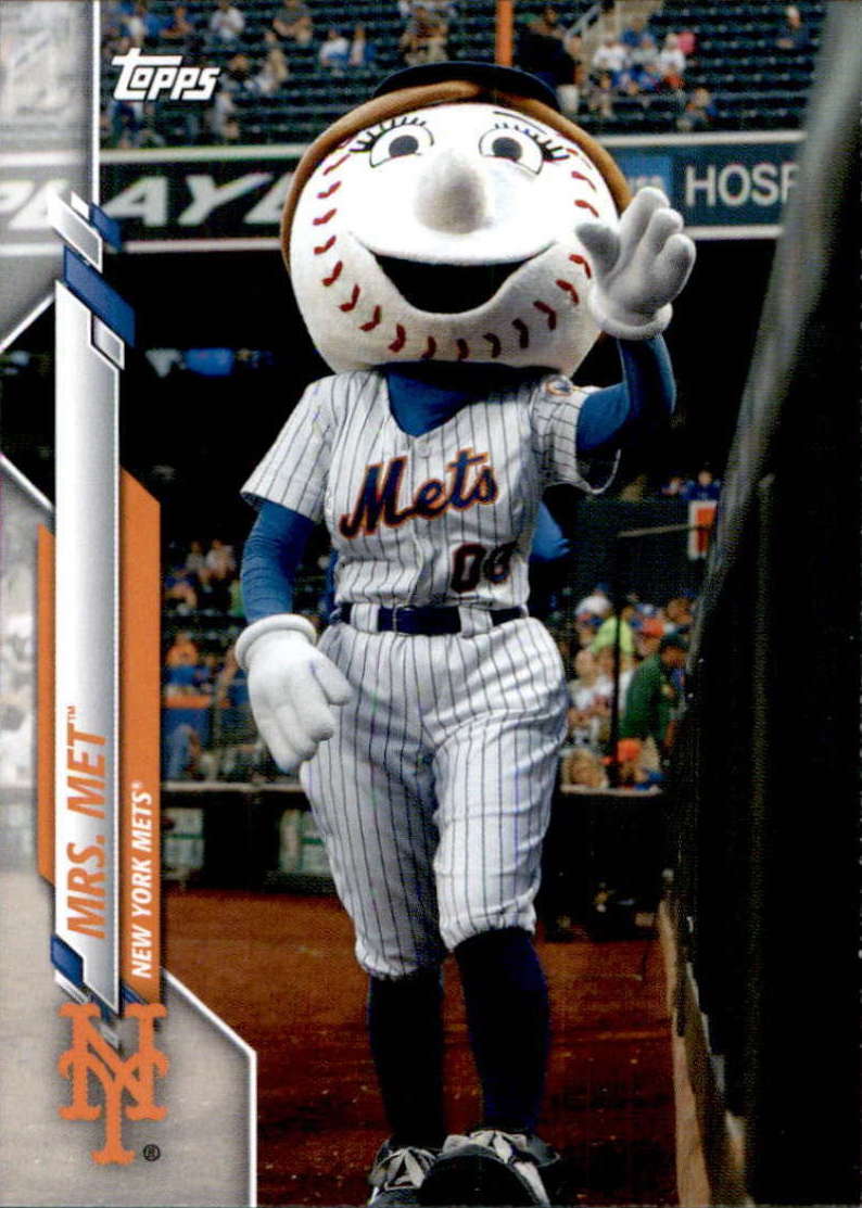
Here’s a card that you can use to win a bar bet one day, whenever we get to return to sitting in bars and making dumb bets in them. As far as I can tell, Mrs. Met is the first woman to appear on a Mets card. Or maybe that should be better expressed as the first female, since most women I know don’t have oversized heads with painful-looking red stitches. I don’t recall a Joan Payson tribute card, though that would have been nice, or a Lorinda deRoulet commemorative card, though that would have been weird. Nope, I’m pretty sure the honor belongs to Mrs. Met, courtesy of this Mascots insert card from the Opening Day set. Yes, Mr. Met is in it too. If you’re a person determined to be upset about things (don’t be), fair warning that the Mascots set also includes Mr. Red and his counterpart Rosie Red.
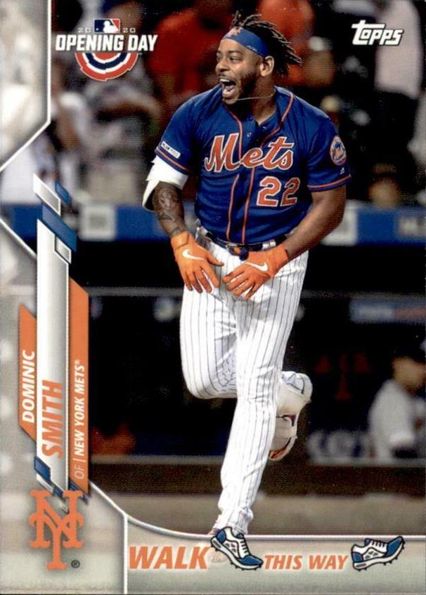 I mostly pass up insert cards, but I had to have this “Walk This Way” card from Opening Day, featuring Dominic Smith at the very last moment of the very last Mets game of the 2010s.
Emily and I were in the park for that game as it wended its way through extra innings. I leapt to my feet when Dom made contact and rushed to the railing of our section to verify that yes, Dom had hit a season-ending walkoff. And the memory of that game sustained me through the offseason, making me smile when the world was frozen and baseball was very far away.
I had no idea just how far away, of course — none of us did. Just as none of us knows how far away it is now. But there’s that iconic moment in cardboard. It’s Dom Smith’s card in The Holy Books, and I can only hope the world is wonderful enough to let him surpass it one day and create an even more indelible memory. And if not, hey, it gave us this one.
For now, it’s what I have — a little thing, a memory of the last time baseball was our companion. Here’s to every little thing that will help sustain us until it is again.


Jason, your treatises on baseball cards are always up there with Gary, Keith and Ron going through a box of them during a rain delay, which I think should be a weekly show on SNY, maybe nightly right now. Always a great read.