The blog for Mets fans
who like to read
ABOUT US
Faith and Fear in Flushing made its debut on Feb. 16, 2005, the brainchild of two longtime friends and lifelong Met fans.
Greg Prince discovered the Mets when he was 6, during the magical summer of 1969. He is a Long Island-based writer, editor and communications consultant. Contact him here.
Jason Fry is a Brooklyn writer whose first memories include his mom leaping up and down cheering for Rusty Staub. Check out his other writing here.
Got something to say? Leave a comment, or email us at faithandfear@gmail.com. (Sorry, but we have no interest in ads, sponsored content or guest posts.)
Need our RSS feed? It's here.
Visit our Facebook page, or drop by the personal pages for Greg and Jason.
Or follow us on Twitter: Here's Greg, and here's Jason.
|
Let's Go Skyliners?
by Greg Prince on 13 April 2007 7:33 pm 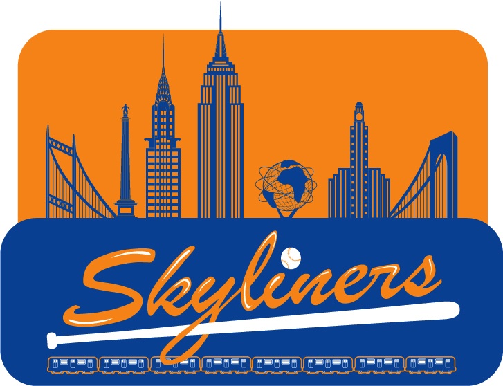
Imagine if we hadn’t been Mets. We could have been Skyliners. It was one of the names under consideration in 1961 before Mets carried the day. Jim Haines of Zed Duck Studios worked up this early ’60s logo celebrating a five-borough skyline to give us an idea of what we might have looked like in one alternate reality.
|
|




Neat!
Skyliners would have done very nicely. That logo is real nice..I like the idea of all 5 boroughs included. . Now this logo would co-inside with the 64' 65' Worlds Fair as the Unisphere is front and center.. I wonder what would have been chosen if the Fair was never here? Probably a bridge I guess? The Tri-boro is in it already, as a flanker. That other flanker bridge looks like the Varazano. It could possibly be one of the two outer east river bridges..I wonder? It would have to be a prominant landmark. Did we have one in Queens prior to the Fair?
As an avid birder you would think I would like the Meadowlarks. I dont.
While its not impossible to see one in Queens in the early spring. I dont associate that bird with our area. Its regular but rare. I wonder if Mrs. Payson spent any time birding herself?
Nope Skyliners have my vote. Boros would be second of the suggested choices..
Keep the faith..And fear the Braves…I still do..
Great conceptual logo, especially since the alternate name would still have reflected the National League's return to the city.
I like the placement of two bridges on opposite ends – it inspires the same affect of bridging the boroughs together as does the single structure spanning across the entire Met logo. Both have design distinguishable to specific NYC bridges, however, since the logo would have been created in late 1961 that bridge would be the Whitestone, not the Verizano (the MTA had yet to begin construction of that span )and it's also properly placed in a west to east direction. The Unisphere was unveiled as part of the 1964 World's Fair so it could not have appeared in an original developed at that time. The world in the center is a great idea so the statue of Atlas holding the world situated in Rockefeller Center could have appeared in the middle instead.
New York Skyliners? Sound's more like a take off of the doo-wop group. Might have been appropriate for Dodger and Giant fans since they did release the song “Since I Don't Have You” in late 1958.
For the record, left to right:
Triborough Bridge; Henry Hudson Memorial Column; Chrysler Building; Empire State Building; Unisphere; Williamsburgh Savings Bank; Verrazano Bridge
Joe,
I believe it was Mr. Moses's influence that dictated the inclusion of the projected World's Fair symbol within the Sklyliner logo ahead of the opening. He really insisted on synergy for all the projects he oversaw.
Hi Greg,
Sorry I misunderstood your earlier writing. I thought it was recently done to re-create what might have been and didn't realize it was actually designed by Mr. Haines more than 45 years ago.
So along with the Unisphere, future symbol of the 1964 World's Fair, Robert Moses also wanted the yet-to-be-built Verrazano Narrows Bridge included as well. If he wanted a specirfic symbol for the Bronx, Moses simply could have inisisted that the artist include a white stripe to indicate the destruction of neighborhoods caused by the Cross Bronx Expressway (please excuse the editorial comment LOL).
Sadly, Mr. Moses would have probably taken glee in that white stripe.
And Mr. Haines was obviously a Verrazano visionary given its failure to exist circa 1961 (to say nothing of his own).
In the end they took the skyline anyway..And it works! I like the above logo, but the more I think about it..It may not translate on an arm patch as well.
I really would like to see an alternative patch. Perhaps for the opening of the new park incorporating the unisphere. I always loved that 64' 65' patch…
Pcelli60
The 2004 40th Shea anniversary patch kind of echoed that World's Fair patch which I agree was quite distinctive. I imagine we'll see a Goodbye Shea patch in '08 and a Hello Citi in '09.
Appropriate merchandise no doubt on sale in the Citi Shop.
Hoped you saved one of your plastic soda cups from Shea back in 2004 which had the 40th anniversary logo on it. The Mets also gave away replicas of their 1964 jersey with the 1964 patch for the World's Fair on the sleeve. We got 'em both.
“Hello Citi”
LOL
What would that look like? A ballplayer with no mouth?